Brand Identity →


New brand identity reflects who we are and embraces our dynamic future.


About →

Reflect Studio is a design + manufacturing office focusing on garments and everyday objects. We leverage brand identities of institutions through aesthetic, functional, and sustainable products.

Working with a variety of institutions in the fields of education, arts and culture, in addition to non-governmental organizations and companies, Reflect Studio embraces every phase of production from gathering insight to identifying design objective, manufacturing, visual documentation and on-time delivery of a collection. This full-service approach is constructed in adaptable and collaborative design practice, and paired with our manufacturing expertise within distinct industries.

Reflect Studio thrives by experimenting with innovative methods through its R&D projects and creates value for its clients by grounding designs on diligently and responsibly manufactured products. The result is objects that have utility and longevity, those that provide delight for the people and institutions using them.

Artboard 1 copy 2@2x-100.jpg

01.
Logomark


The design of the logomark comes from the Studio’s core value proposition of: Design + Manufacturing, Leverage, Collaboration & Full-Service. It’s a reflection of our core identity.

As a starting point the core value proposition was turned into a visual index and represented in the most simplified way. The common element of this index then became the logomark’s center piece. Initials of Reflect Studio were kept to visually relate with the name and the length of the line is based on the spacing between initials. The logomark is flexible and adaptable like the studio itself, the length of the logomark may vary. It represents Reflect Studio’s full-service approach and adaptability.

Artboard 1 copy 13@2x-100.jpg


The design of the logomark comes from the Studio’s core value propositions of: Design + Manufacturing (+), Leverage (↗), Collaboration (x) & Full-Service.


Comp-1.gif

The logomark is flexible and adaptable like the studio itself.

 
5.jpg
 

02.
Logotype


The logotype has been created by customizing Favorit Std. Regular. Kerning is adjusted to make the logotype recognizable & legible at all sizes and applications.

Artboard 1 copy 13@2x-100.jpg


The visual language combines the Studio’s two contrasting aspects:
subtle & neat design and the raw aesthetic of manufacture.


03.
Typography


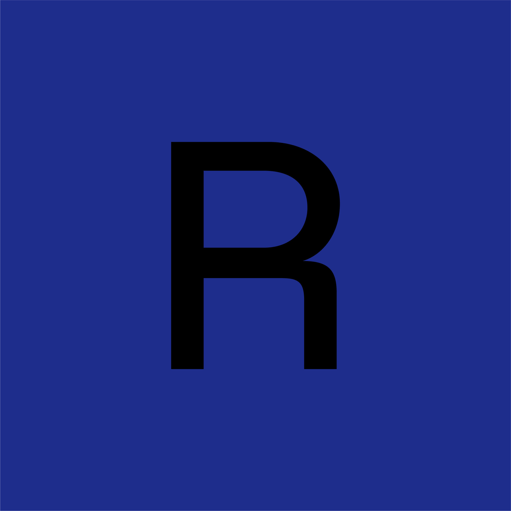
Favorit Std - a straightforward low contrast grotesque typeface that combines a rigid drawing with subtle oddities - is choosen as the primary typeface. With a unique uppercase R and retaining a personality of its own Favorit Std. is Reflect Studio’s voice on all kinds of communication materials across print and digital mediums.

Artboard 1 copy 13@2x-100.jpg
 

↳ Favorit’s set of glyphs are expanded and an icon set is created.


↳ Basic stationary displays the adaptibility of the design system and usage of typography across printed materials.


04.
Color 


Taking inspiration from the raw aesthetic of manufacturing, shades of gray, black & white are chosen as Studio’s primary palette. Bright blue is added to the color palette to keep the identity young and sophisticated.

Color_Layered'.gif

05.
Brand Guidelines 


Detailed identity guidelines created for the consistency on all kinds of communication materials and products. An adaptable and functional design system is created.

Artboard 1 copy 13@2x-100.jpg


19.jpg


↳ In the upcoming weeks, we will be updating all our communicative materials over in our online presence. Meanwhile, we invite our business partners to contact us via email to hello@reflectstudio.com to download the guidelines.